
Wizzies
Wizzies Iced Tea is a family-owned beverage brand preparing to expand beyond local distribution. As the company explored broader retail opportunities, the packaging needed to evolve from a small-scale product label into a cohesive brand system capable of standing out in competitive shelf environments.
I worked alongside the team to develop a refreshed visual identity and scalable packaging system that could support multiple flavors while maintaining strong brand recognition.
Brand Identity Development
Packaging System Design
Color Strategy
Typography System
Production Coordination
Art Direction > Shawn Gorman, Mike Cloppse
Food Photography > Wizzies


Challenge
The existing packaging lacked visual consistency and did not clearly differentiate flavors at a glance. As the brand prepared for wider distribution, the labels needed to accomplish several objectives simultaneously:
• Increase shelf visibility in crowded retail environments
• Communicate flavor quickly and clearly
• Maintain a sense of craft and authenticity
• Create a flexible system for future flavor expansion
• Work within standard bottle and label production constraints
The design had to balance expressive personality with functional clarity.

Strategy
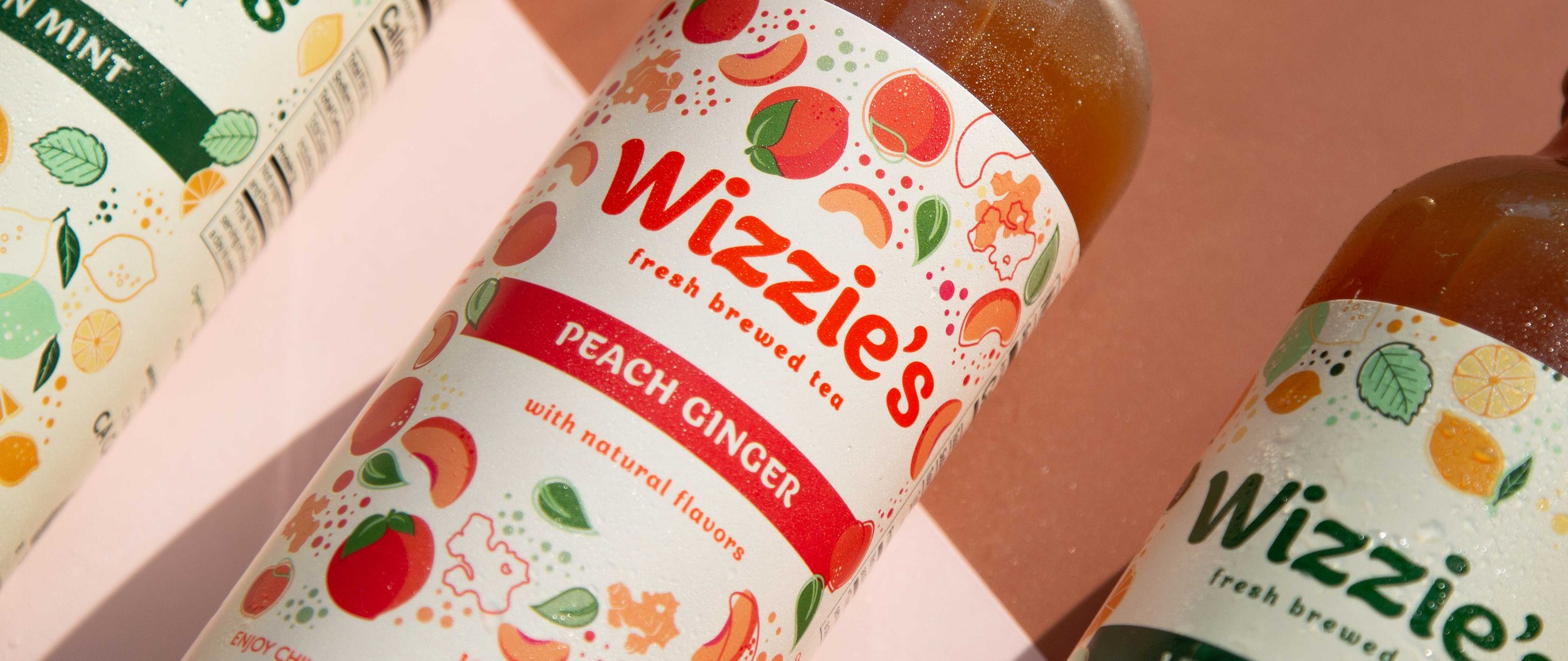
The design strategy centered on building a modular system rather than designing individual labels. The goal was to create a repeatable structure that could scale across flavors while preserving brand recognition.
A bold color framework was developed to differentiate each variety while maintaining cohesion across the product line. Typography was simplified and structured to ensure readability at distance, especially in fast-moving retail environments.
Graphic elements were used to reinforce freshness and ingredient-driven storytelling without overwhelming regulatory information or production requirements.
Design System
Color Architecture
Each flavor was assigned a distinct but harmonized color to allow instant recognition. The system ensures that new flavors can be introduced without redesigning the entire identity.Typography
A clear typographic hierarchy was established to prioritize brand name, flavor, and key product information. The structure supports both close inspection and quick shelf scanning.Label Layout
The label design balances expressive graphics with required regulatory content. Spacing and information placement were carefully considered to prevent visual clutter.Scalability
The system was built to accommodate seasonal or limited-edition releases without disrupting brand consistency.Production Considerations
Label dimensions were designed within standard production parameters to ensure cost efficiency and print reliability. Color choices were evaluated for consistency across print runs, and layout structure accounts for wrapping curvature on bottles.
Material selection and finish were considered in relation to condensation and refrigeration conditions common in beverage retail settings.
Outcome
The final packaging system strengthens shelf presence while maintaining the brand’s approachable and craft-oriented character. The modular structure provides flexibility for growth, allowing the company to expand flavors and distribution without sacrificing visual coherence.
The result is a scalable brand identity that supports both local authenticity and broader market ambition.
