Albi
Rebrand Identity Development
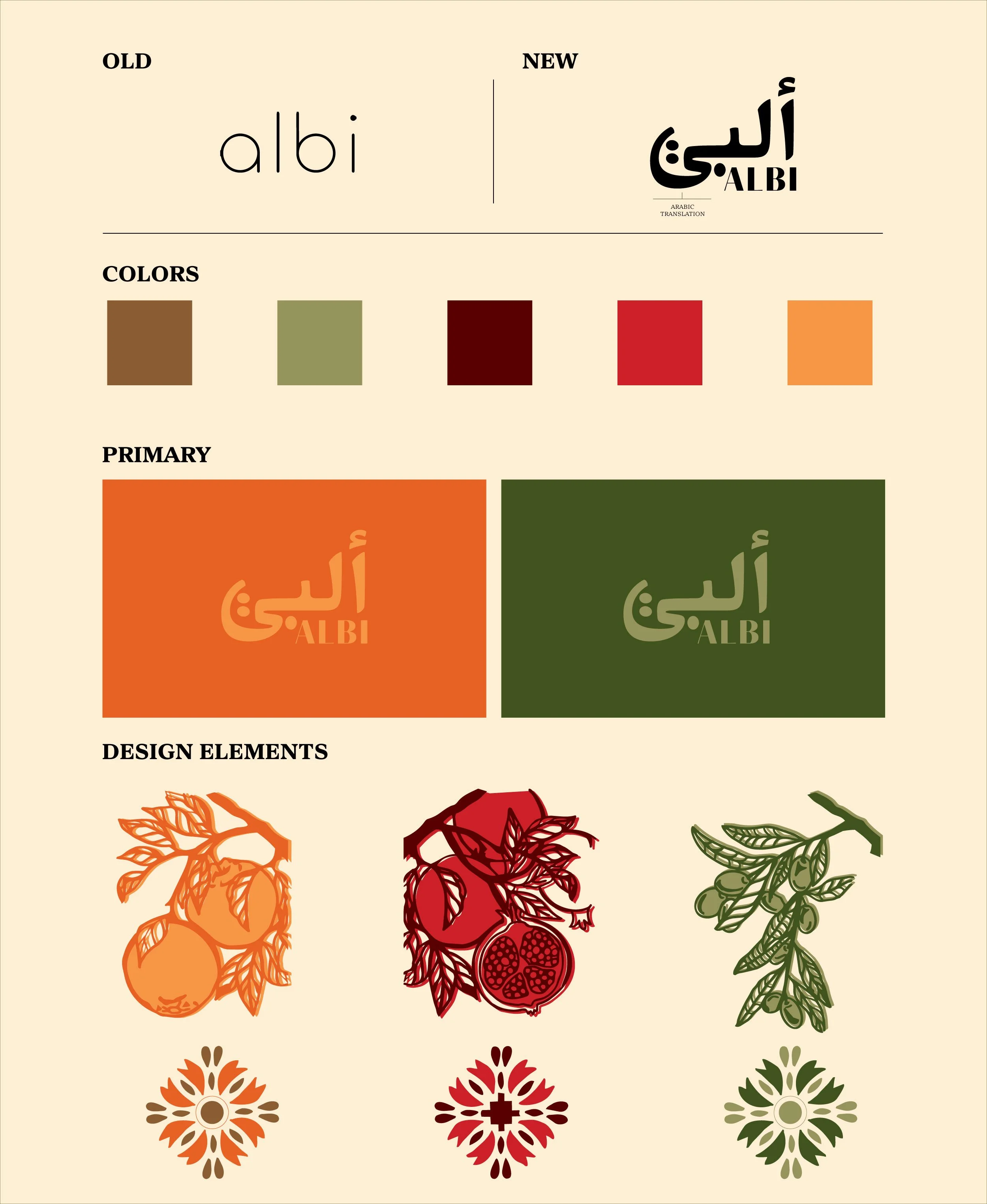
Color Strategy
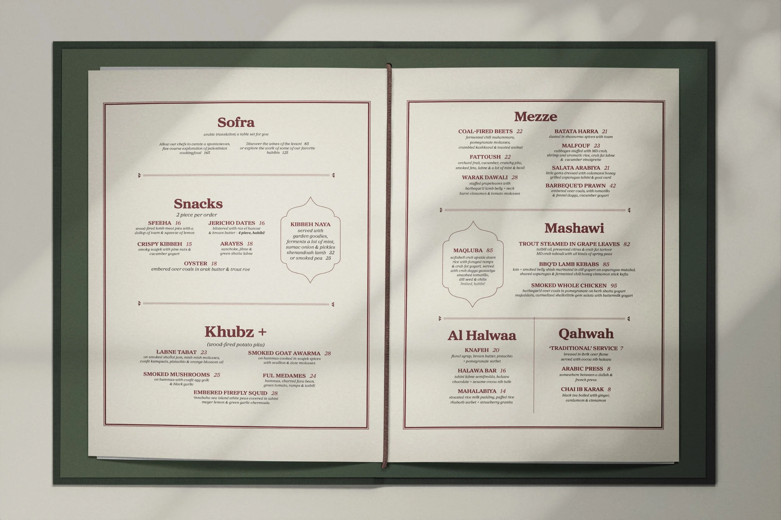
Typography System
Art Direction > Douglas Riccardi
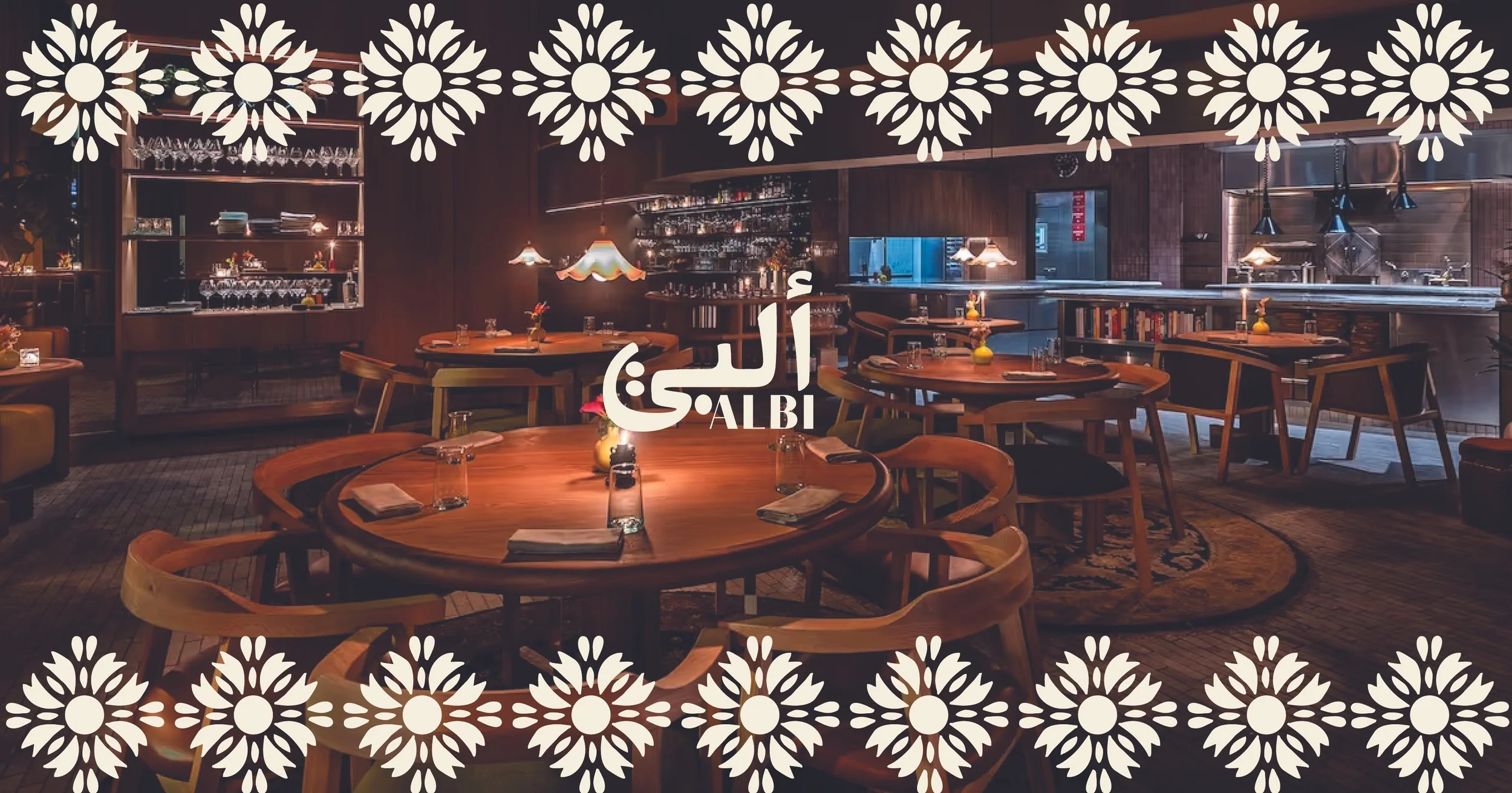
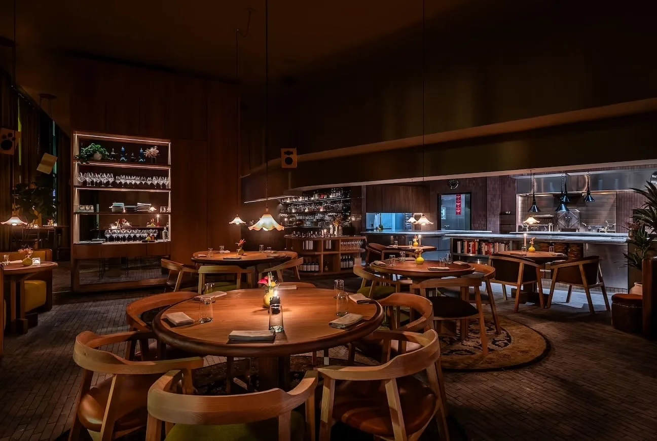
Photography > Albi
For this rebrand, I wanted to challenge the predictable visual language often associated with Palestinian and Middle Eastern restaurants by creating something more emotional, immersive, and contemporary. Drawing inspiration from Arabic calligraphy, Palestinian symbolism, vintage signage in Amman, embroidery, and traditional Levantine patterns, I developed a visual identity system that balances cultural authenticity with modern design.
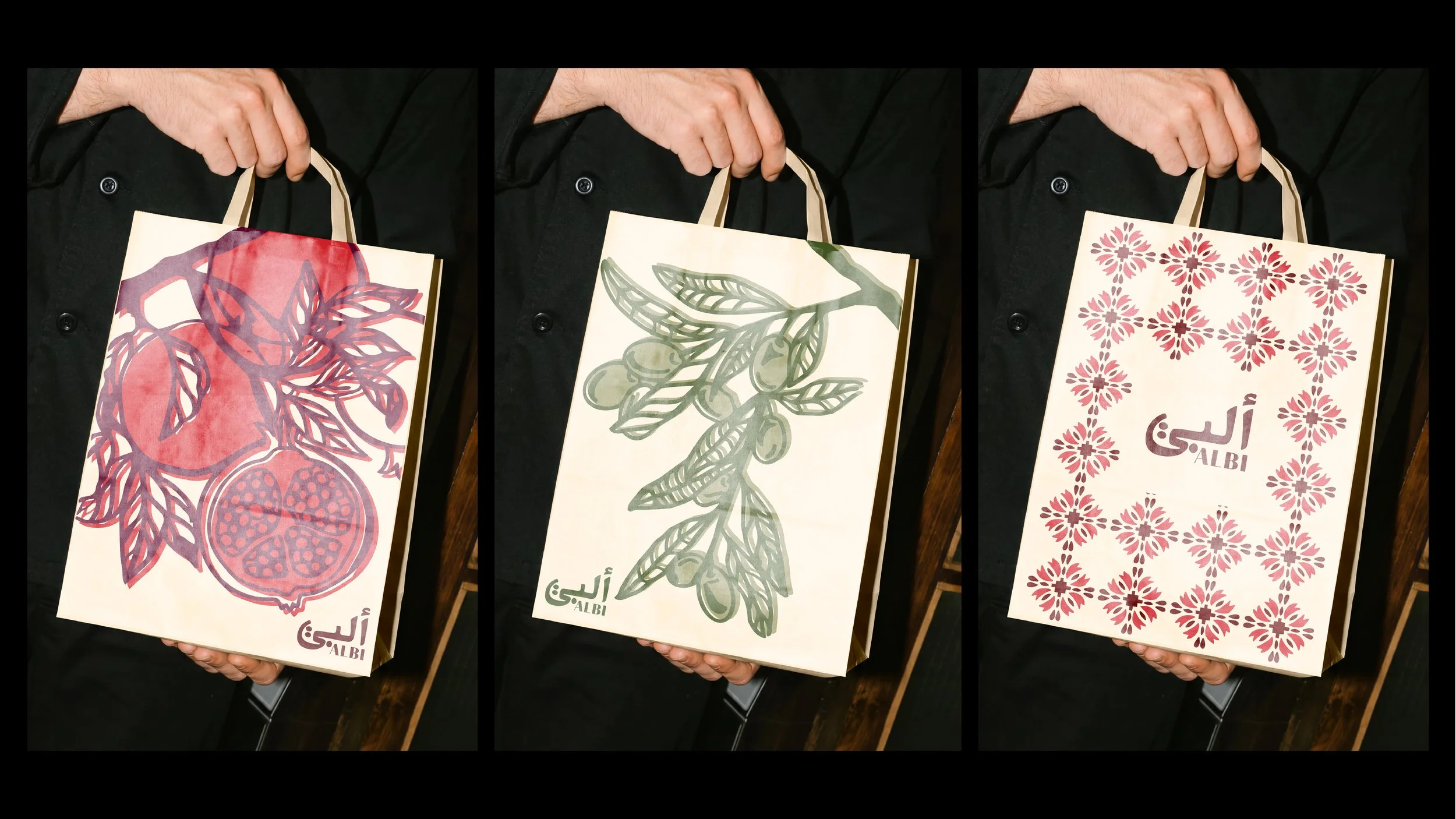
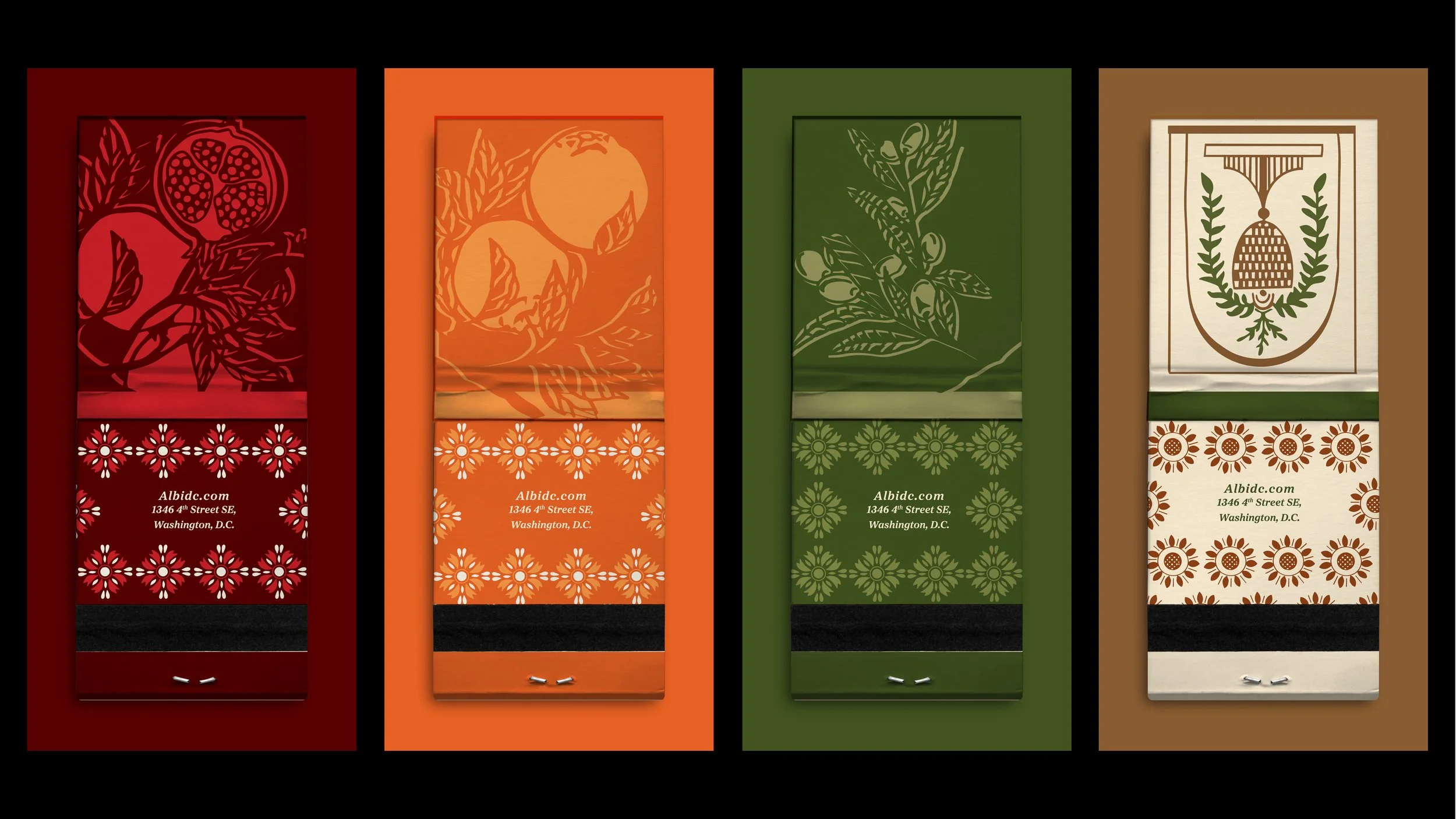
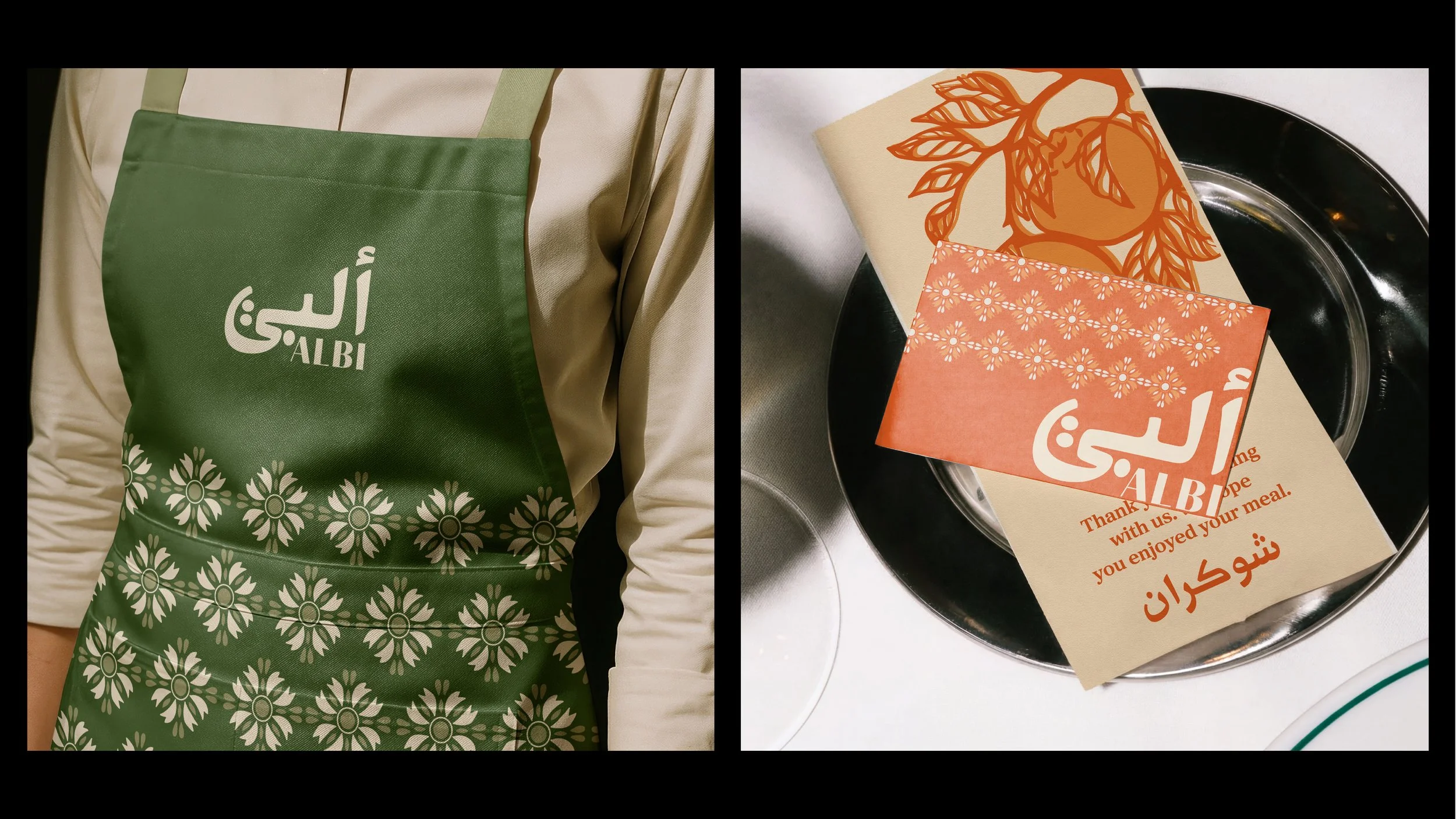
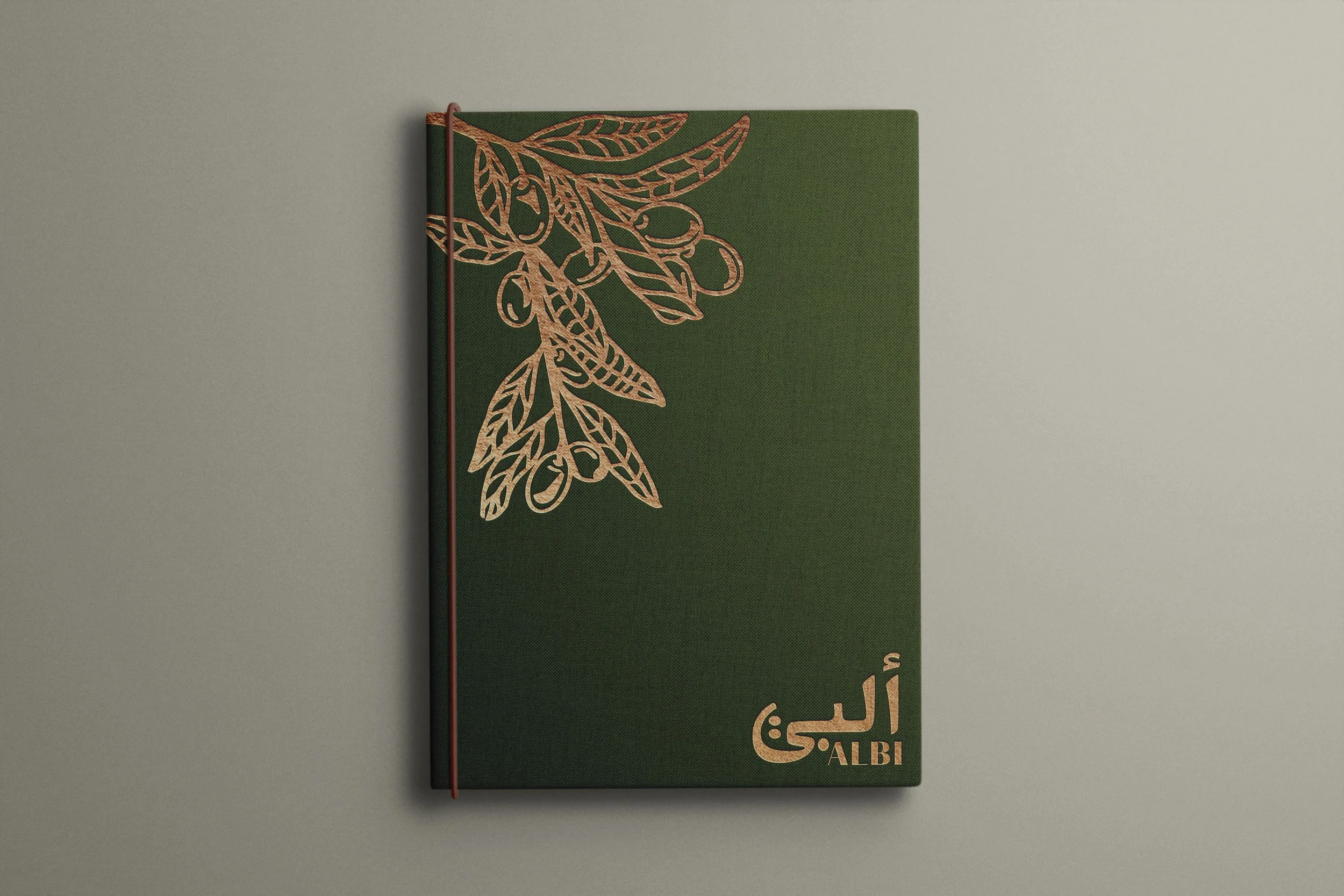
The final branding system extends across menus, matchbooks, packaging, apparel, and digital applications through layered compositions, hand drawn illustrations, warm earthy tones, and typography that blends Arabic and English influences into one cohesive visual language.
Research & Opportunities
Albi is a contemporary Palestinian restaurant by Michael Rafidi that blends traditional flavors with modern dining. Rooted in warmth, fire, hospitality, and storytelling through food, the restaurant creates an elevated experience while still feeling deeply personal and connected to culture.
While researching Albi’s current identity, I found that the restaurant itself already carries a strong emotional and sensory experience through its food, interior, and hospitality.
The opportunity became creating a visual identity system that better matched that richness.
Areas for evolution included:
Stronger storytelling through branding
More immersive visual systems
Greater consistency across applications
A warmer and more tactile visual direction
A stronger connection between culture and contemporary design
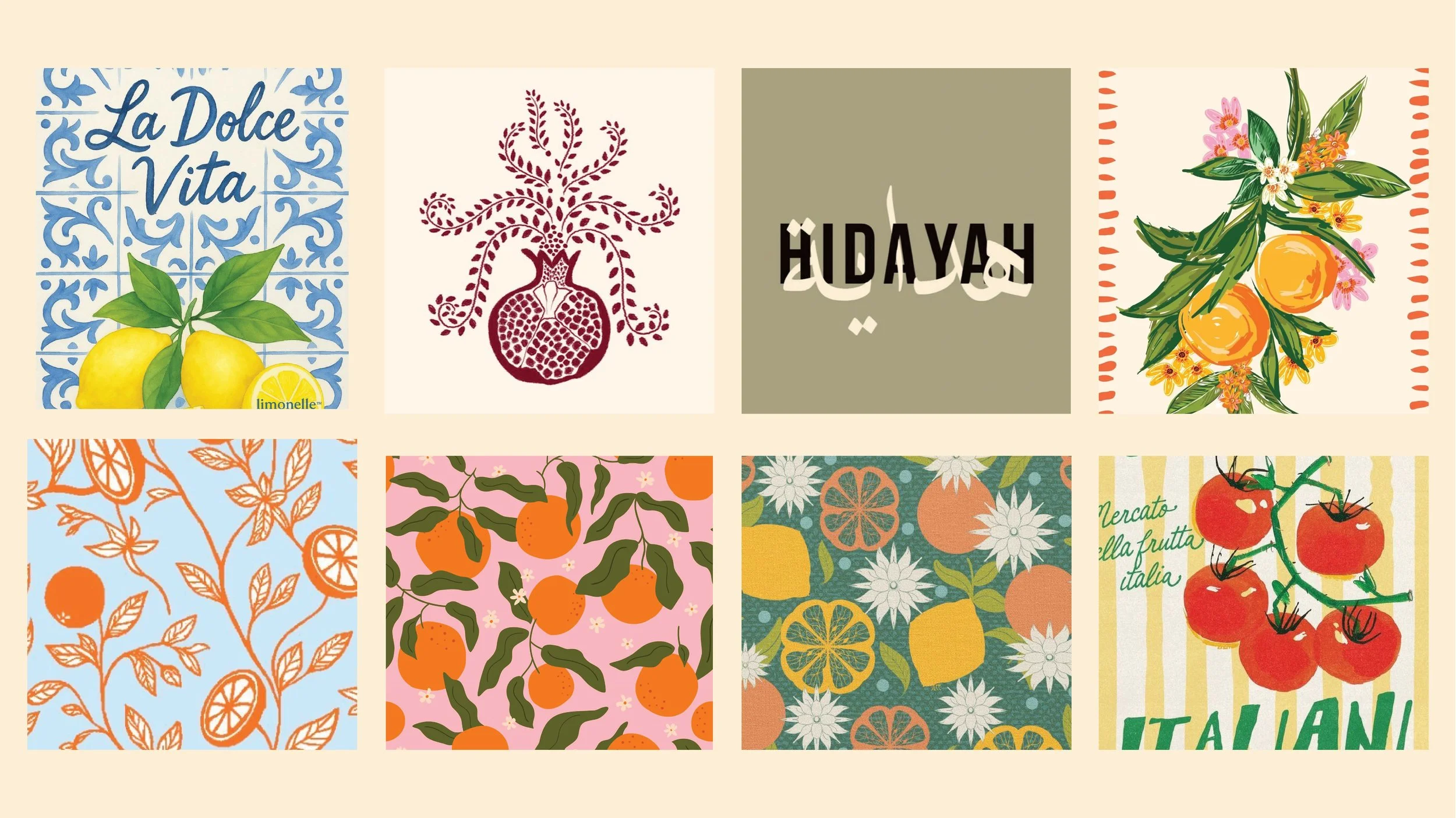
Visual Inspiration
The visual language for this project was inspired by:
Arabic and enlglish calligraphy
Palestinian symbolism
Traditional embroidery
Hand painted typography
Levantine geometric patterns
The project also explored themes of nostalgia, identity, craftsmanship, memory, and storytelling throughout the branding system.
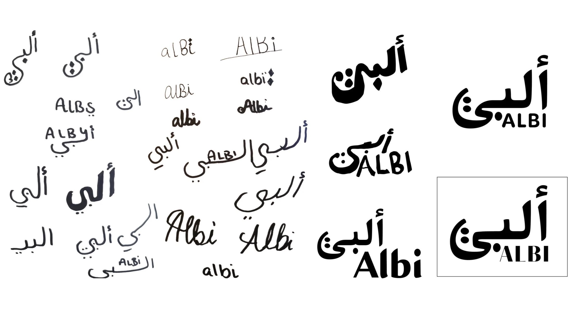
Logo Development
The logo process focused on exploring multiple contemporary interpretations of Palestinian visual culture.
Rather than leaning into clichés, the direction explored abstraction, rhythm, typography, and symbolism to create a visual identity that feels expressive while remaining refined.
The final logo system uses earthy tones including brown, green, orange, and deep red to reflect warmth, land, fire, and growth.